Hi Guys,
We have had a few questions about our Chermside West Project renovation so we thought we would take you on a stroll through the interior renovation and style of this suburban beauty.

The Brief
This full family of 5 (+ a cute little furry family member) were looking for a downstairs refresh. The rooms included the entry, rumpus, living, dining, kitchen, bar and outdoor. In terms of style, Mum is a lover of all things soft blue, sage and floral patterns. Overall, a transitional interior design style was chosen for the inspiration of the project. The chosen inspiration board was a collaborative process amongst the family, which we love!

The Journey
After thorough discussions of the likes, dislikes and wants of the family home, we pieced the scope of works together which included updating the flooring throughout, painting the interior, a full kitchen renovation, laundry renovation (keeping the existing tiles and cabinetry carcass), adding a built-in bar to the billiards room, window furnishings, and of course furniture and styling pieces to complete the look.
Planning the renovation with our clients involved lots of fun visits with tiles, flooring, bench top samples, and paint colours, and of course the detailed planning of the custom cabinetry.
The End Result
Lots of detailed design elements were added to the spaces to create mood, interest and depth. We added wall paneling on the lower half of the walls in the bar area and had them painted in the dark and moody colour Monument by Dulux Colorbond. Don't be alarmed at using dark colours - if there is enough natural light in the space it can create just the right amount of depth and mood (especially in a bar and pool room).
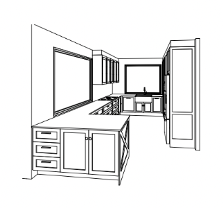
For the queen of soft blue and sage, we wanted to honour her love for colour in the kitchen renovation. The cabinetry is soft and subtle: Porters Paints - Newport Blue complemented by Matt black iron handles. To add character we opted for a farmhouse sink, reeded glass in some overhead cabinetry and a gorgeous pendant centred in the space. To let these details sing, we decided to go for a subtle marbled engineered stone top benchtop: Smartstone - Davinci Blanco, which was complemented by a textured subway tile splashback: National Tiles - Whoosh White Matt.
The family's love of coffee and hot beverages was considered, with the addition of a coffee station between the oven and fridge. The same engineered stone was used in the shelving for a luxurious detail.
We had an absolute blast working in this project, and were kindly invited over to enjoy the new surrounds over a delicious morning tea with our beautiful client. This is still by far one of our favourite projects we've worked on to date!


Comments